


|
Christ is my all
|
San Antonio, TX

This is my claim: we, as a civilization, forgot how to center things.
I mean, we know how to do it. It has never been simpler:
display: flex;
justify-content: center; /* Horizontal centering */
align-items: center; /* Vertical centering */
(don’t ask why you need to remember four words instead of just horizontal/vertical, it’s still better than before)
Or you can use grids if you want:
display: grid;
justify-items: center; /* Horizontal centering */
align-items: center; /* Vertical centering */
(also don’t ask why justify-content became justify-items)
If you feel like school today, we can deduce it from the first principles:
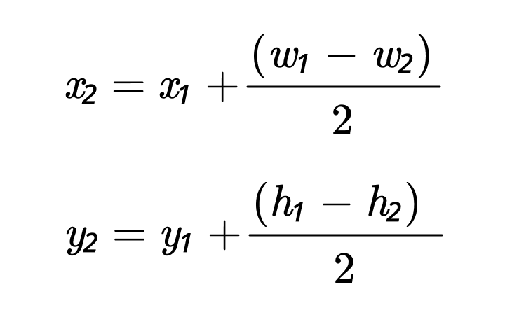
Hey, even ChatGPT knows how to center things:
Okay, maybe not right away, but eventually it gets there.
What I’m saying is: everybody knows how to center things. It’s trivial. And if you are lost, the knowledge is right there.
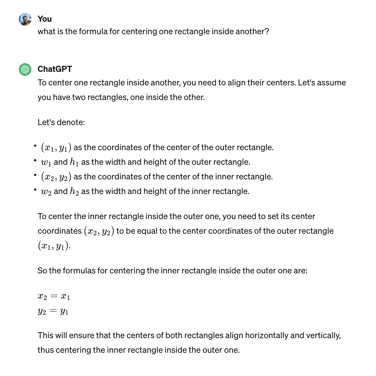
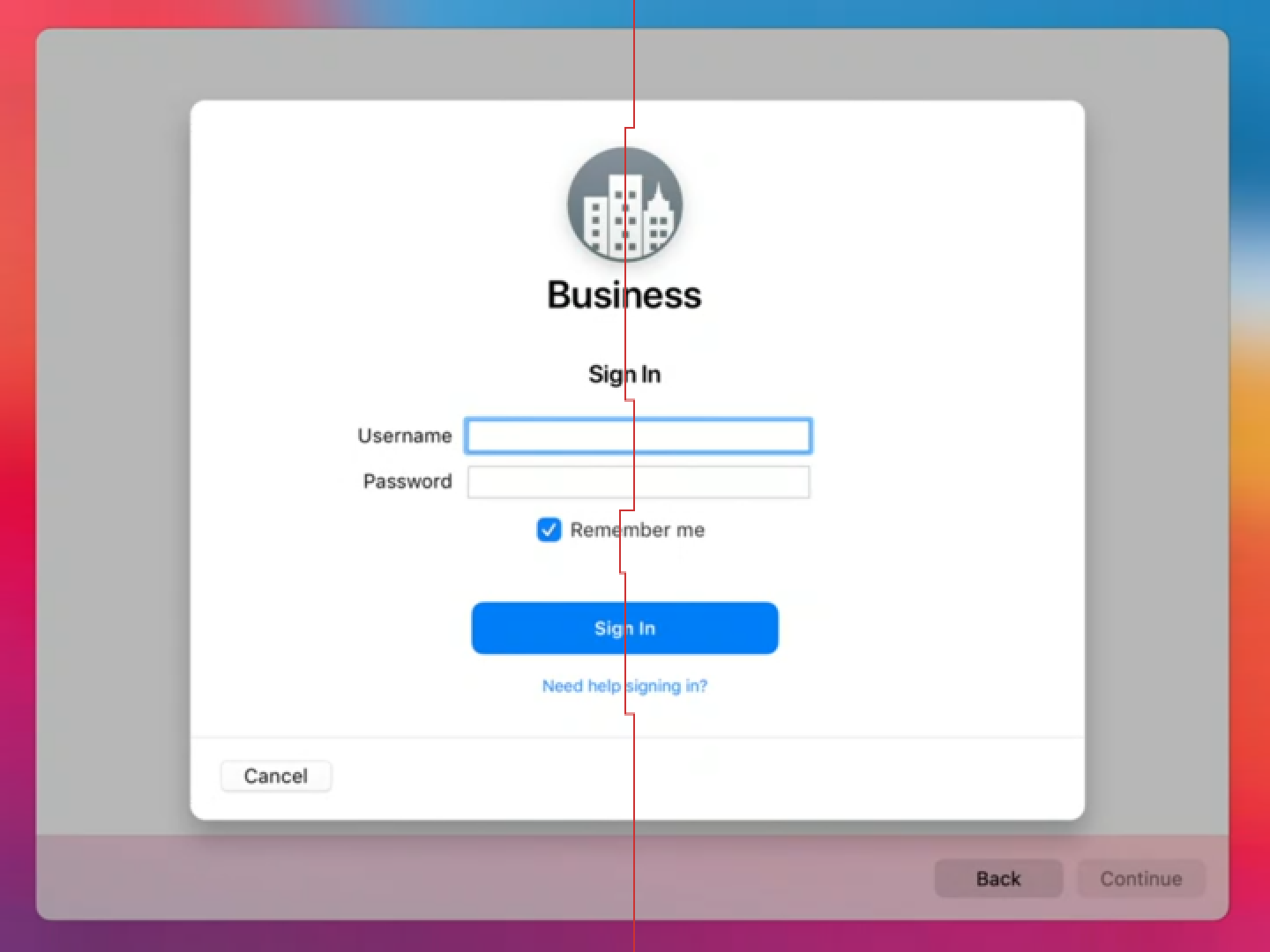
Yet, when we look at actual applications, we see that these methods are not used. We see this:

or this:
or even this:

So something is clearly getting lost between know-how and applying that knowledge.
In theory, there’s no difference between theory and practice. Unfortunately, we live in practice.
So what’s happening? Let’s find out.
Fonts
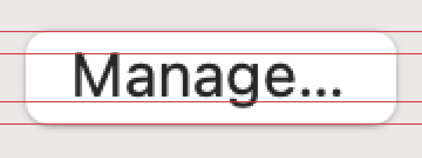
Fonts are one of the biggest offenders. You can see poorly aligned text everywhere. Let me showcase.
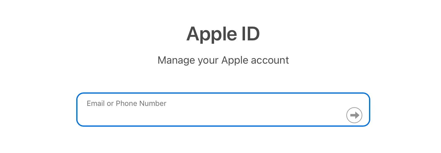
Apple can’t do it:
Microsoft can’t do it:

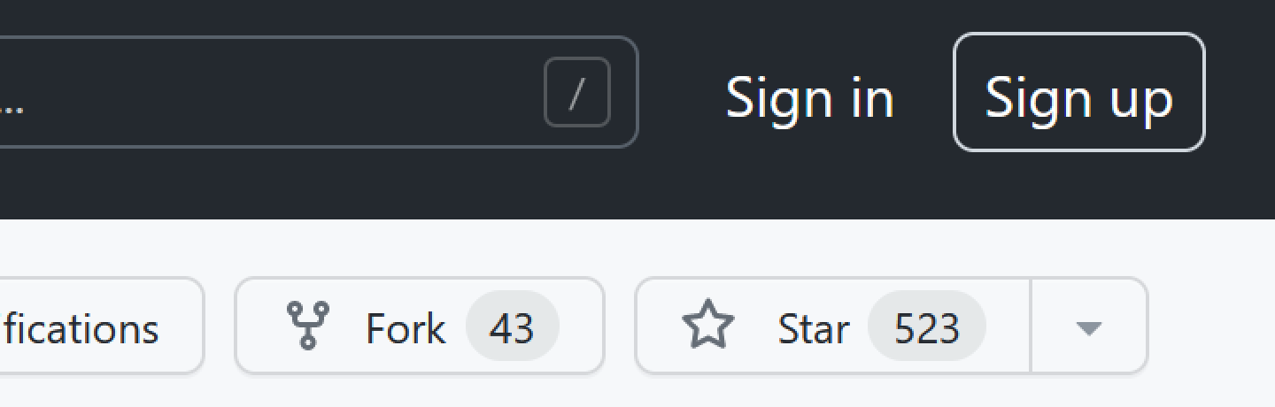
GitHub can’t do it:
Valve can’t do it:

Slack can’t do it:

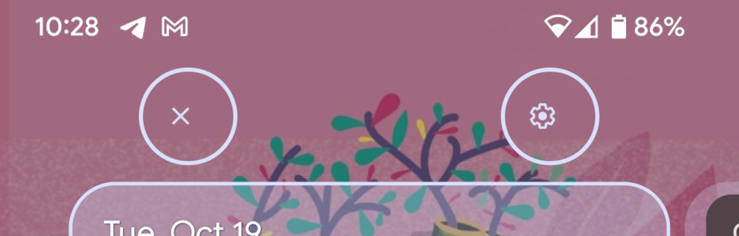
Telegram can’t do it:
Google Maps can’t do it:

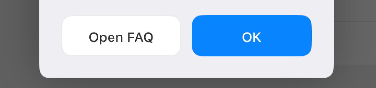
Honestly, I can provide an endless supply of poorly-aligned buttons without even having to look for them:
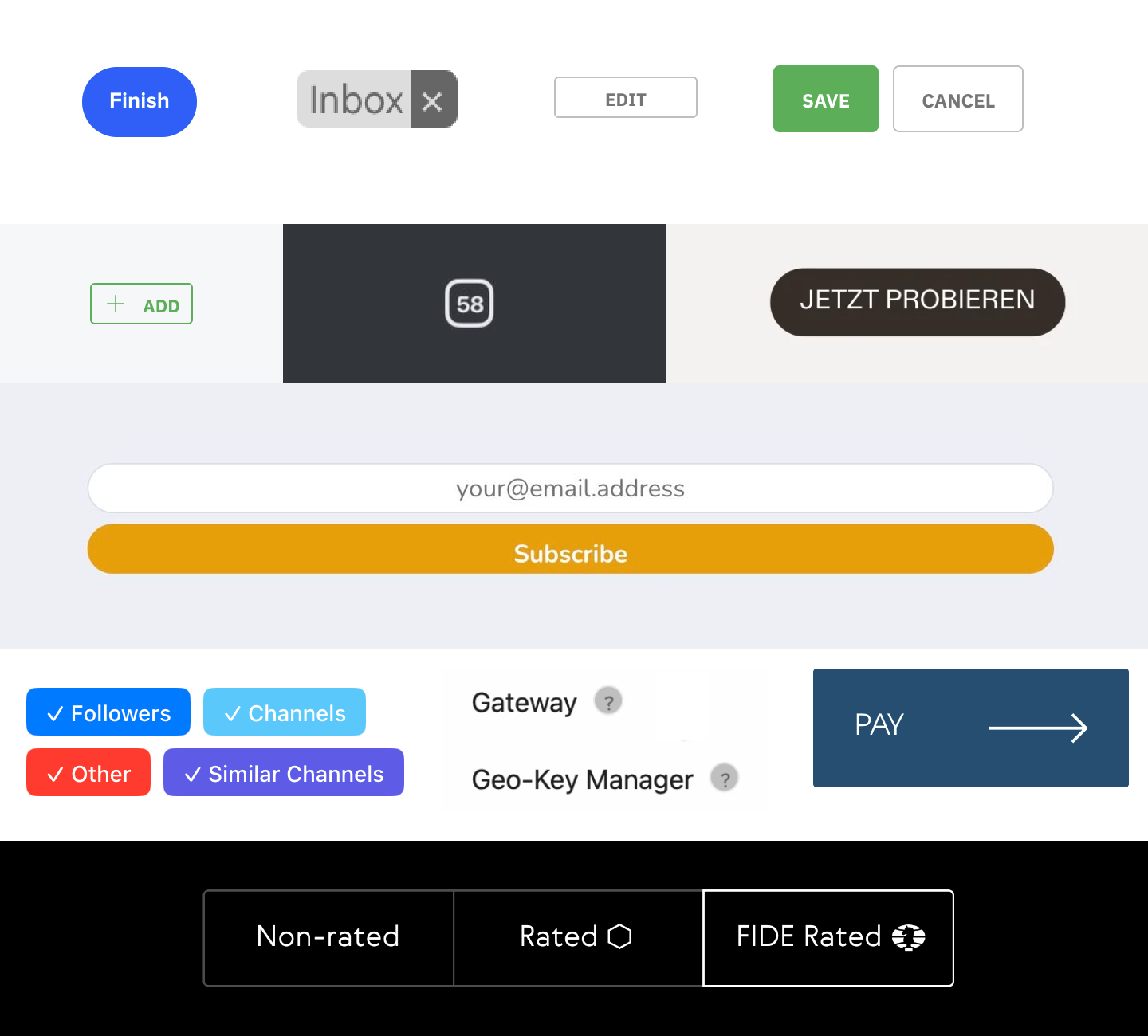
I think you get the idea. Myriad companies big and small, native or web, and none are safe from text-centering problems.
Line height
If font metrics are not enough, the next problem on our way to perfect centering is line-height.
Line height is... complicated. A canonical article to learn about it is Vincent De Oliveira’s Deep dive CSS: font metrics, line-height and vertical-align.
This is how it looks applied in practice. Slack:
Notion:
Airbnb:

YouTube:
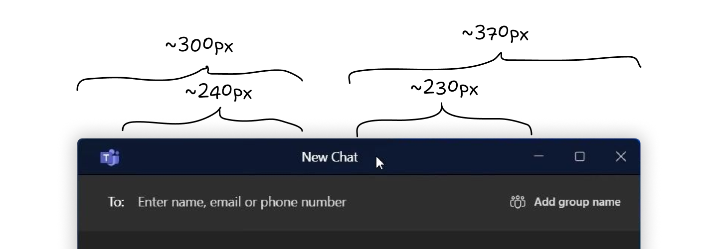
Aligning two things in different containers is almost impossible:

Although many have tried:
Not many have succeeded:
CSS might get in the way (different controls having different defaults which you have to undo before even starting trying to align):

No easy solution here, just roll up your sleeves and delve into specifications.
Icons
Icons are like small rectangles put in line with text. Therefore all problems caused by text AND line height apply here. Aligning icons next to text is a notoriously hard task.
Atom:

Platform formerly known as Twitter:
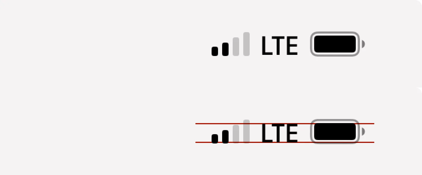
iOS:
Mozilla:

YouTube:
Sometimes icon wins over text:

Sometimes text wins over icon:
Sometimes both lose:

Some icons are just plain old HTML form controls:
Some are stylized:
Sometimes people will get creative to achieve perfect alignment:
But overall it’s a pretty hopeless game:
The problem is, CSS doesn’t help us either. There are 13 possible values for the vertical-align property, but none would align the icon in a meaningful way:
text-align: middle comes closest, but it aligns by x-height, not cap-height, which still looks unbalanced:
That’s exactly why people love web programming so much. There’s always a challenge.
Icon fonts
Aligning rectangles is relatively easy. Aligning text is hard. Icons are rectangles. So what if we put icons into a font file?
Now we can’t align anything:
Neither can we set icon size! In the example above, all icons were set to the same font size and line height. As you can see, all of them come out different sizes, with different paddings, and none were properly aligned.
Despite many shortcomings and almost no upsides, companies rushed to add icon fonts everywhere. The result is this:
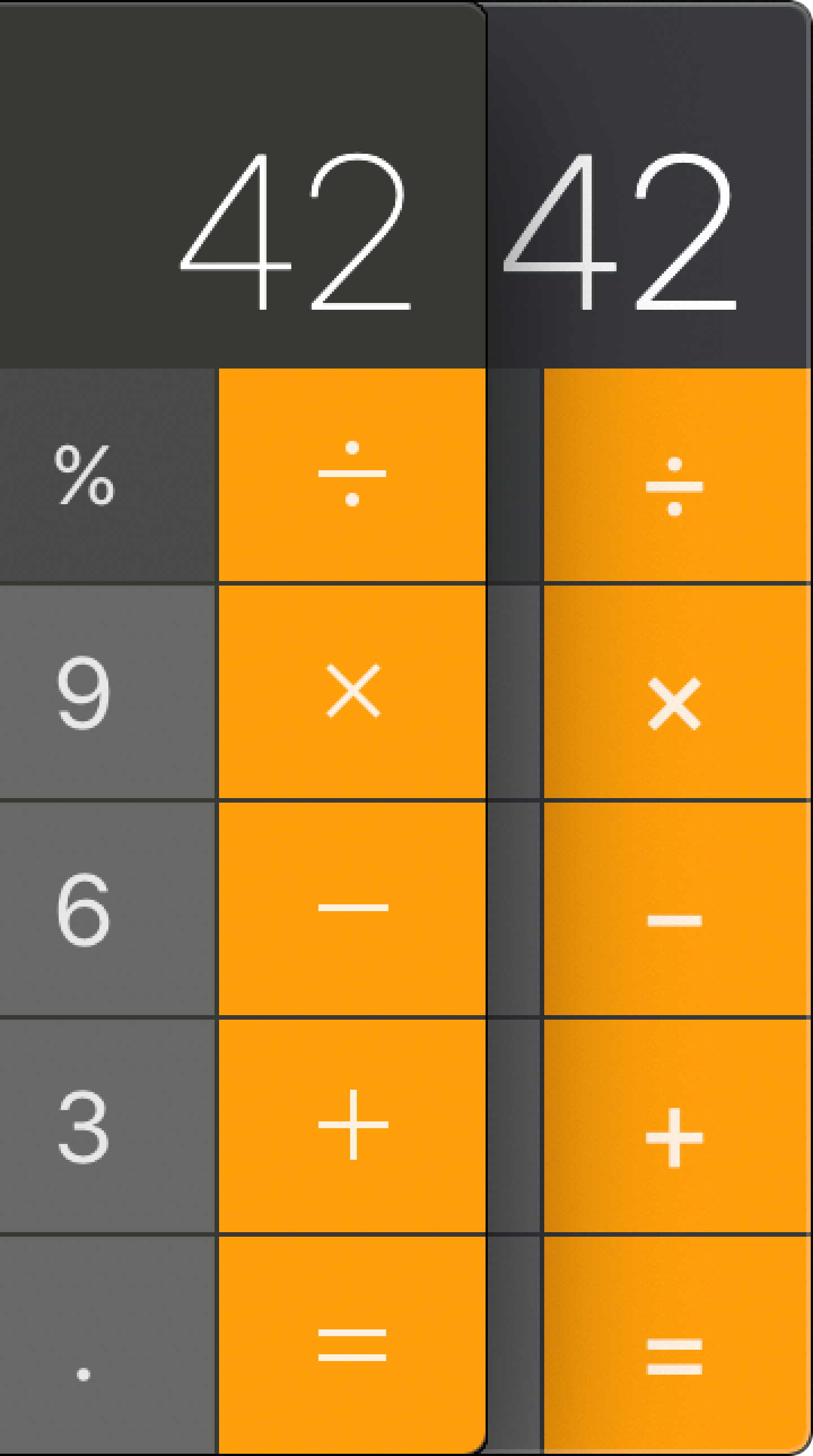
Notice how operators are not vertically aligned anymore and are also blurry. All because of switching to icon font.
Apple was so committed to icon fonts they even ruined the QuickTime record button:
Just look at it:

Yes, it actually looks like this to this day. As does the calculator.
But they are far from being the only ones. One:
Two:
Three:
Four:
Five:
Six:
Seven:
Same as with text alignment, there’s an endless supply of poorly aligned icons.
Skill issue
Not only programmers fail to center things. Designers do it, too:
The problem with icons is that sometimes you have to take their shape into account for things to look good:
Triangle is notably tricky:

Sometimes it is too far to the left:

Sometimes it’s too far to the right:
It can even be too high up (line-height strikes again):

Horizontal centering
You might think that only centering things vertically is hard. Not only! Horizontal might be hard, too:
I don’t think there’s a deep reason for these, except for people just being sloppy:

Just, come on!
Can this be a deliberate decision?
I don’t know. Icons can suffer from it, too:

As can text:

What can be done: designers
So what is the problem?
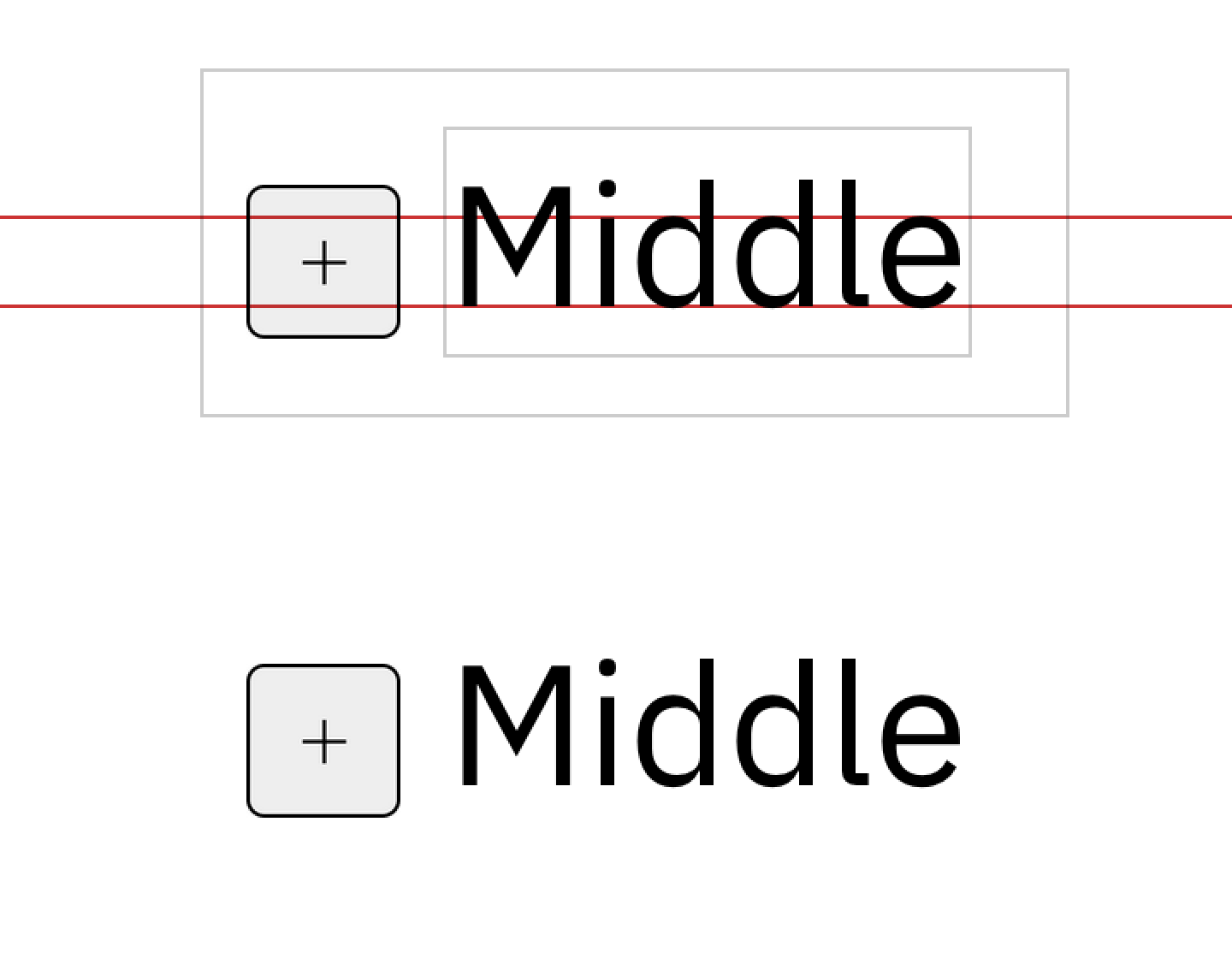
It all starts with the font. Right now, the bounding box of a text block looks like this:

The problem is, it can also look like this:

or this:
Now, what will happen if you try to center text by centering its bounding box?
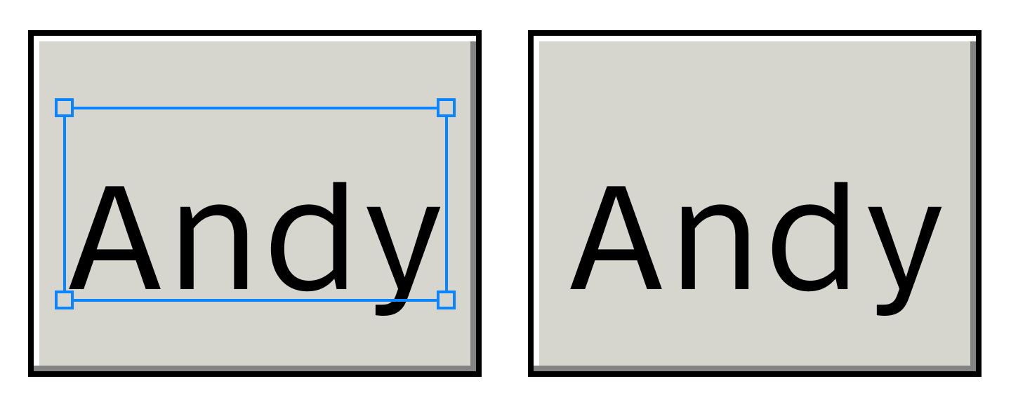
The text will be off! Even though rectangles are perfectly centered.
But even if font can have its metrics unbalanced, it doesn’t mean it does. What happens in reality?
In reality, most of the popular fonts have metrics slightly off. Many have it significantly off:
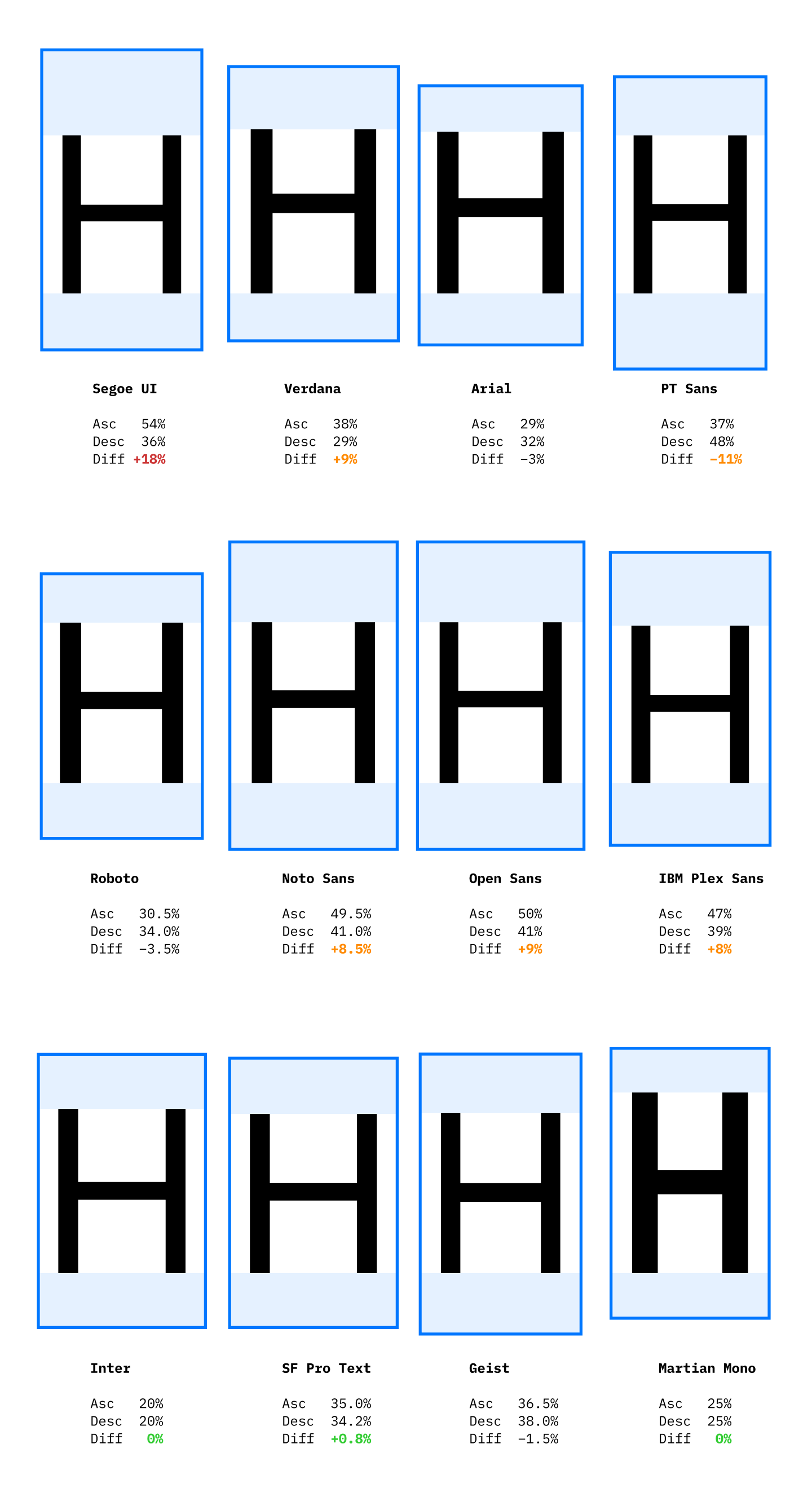
10% is not a small number. It’s a whole pixel in font size 13! Two, if you have 2× scaling! It’s easily noticeable.
Basically, Segoe UI is the reason why Github on Windows looks like this:
The solution is simple: make tight bounding boxes and centering will become trivial:
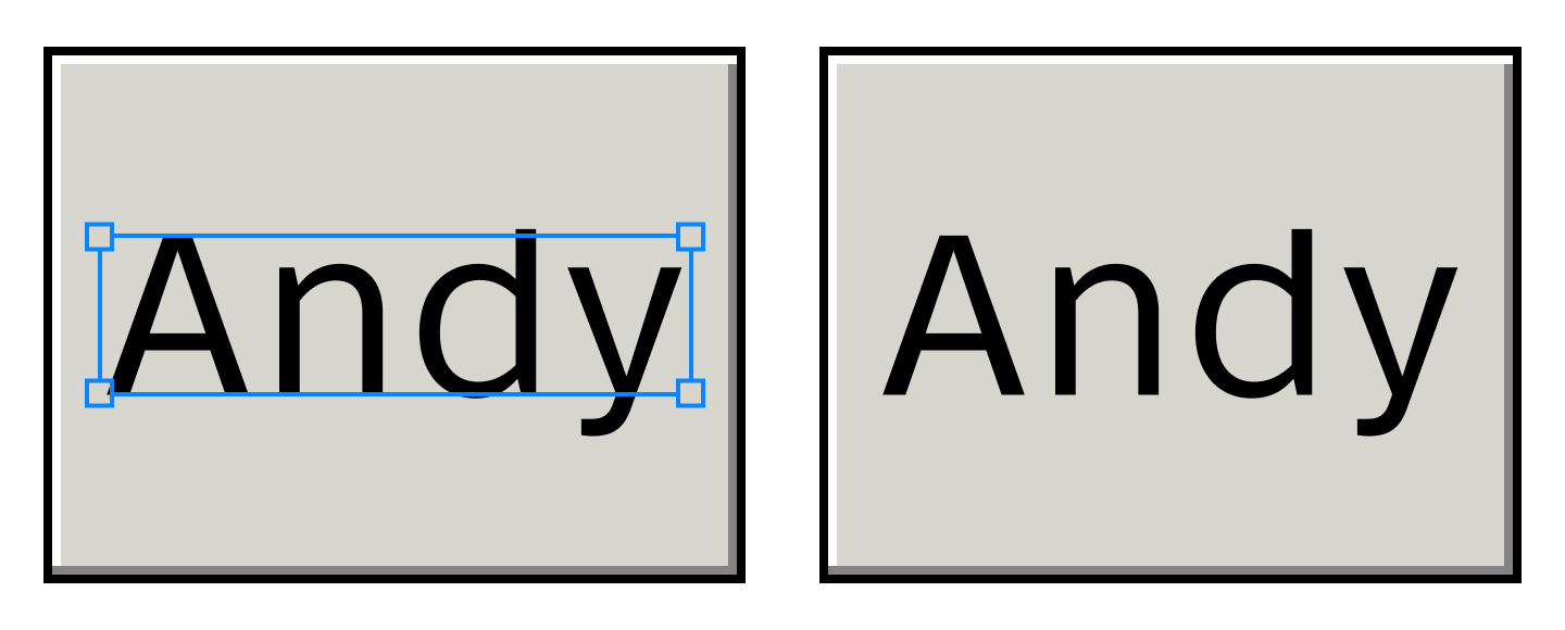
If you use Figma, it already can do this (although it’s not the default):
What can be done: font designers
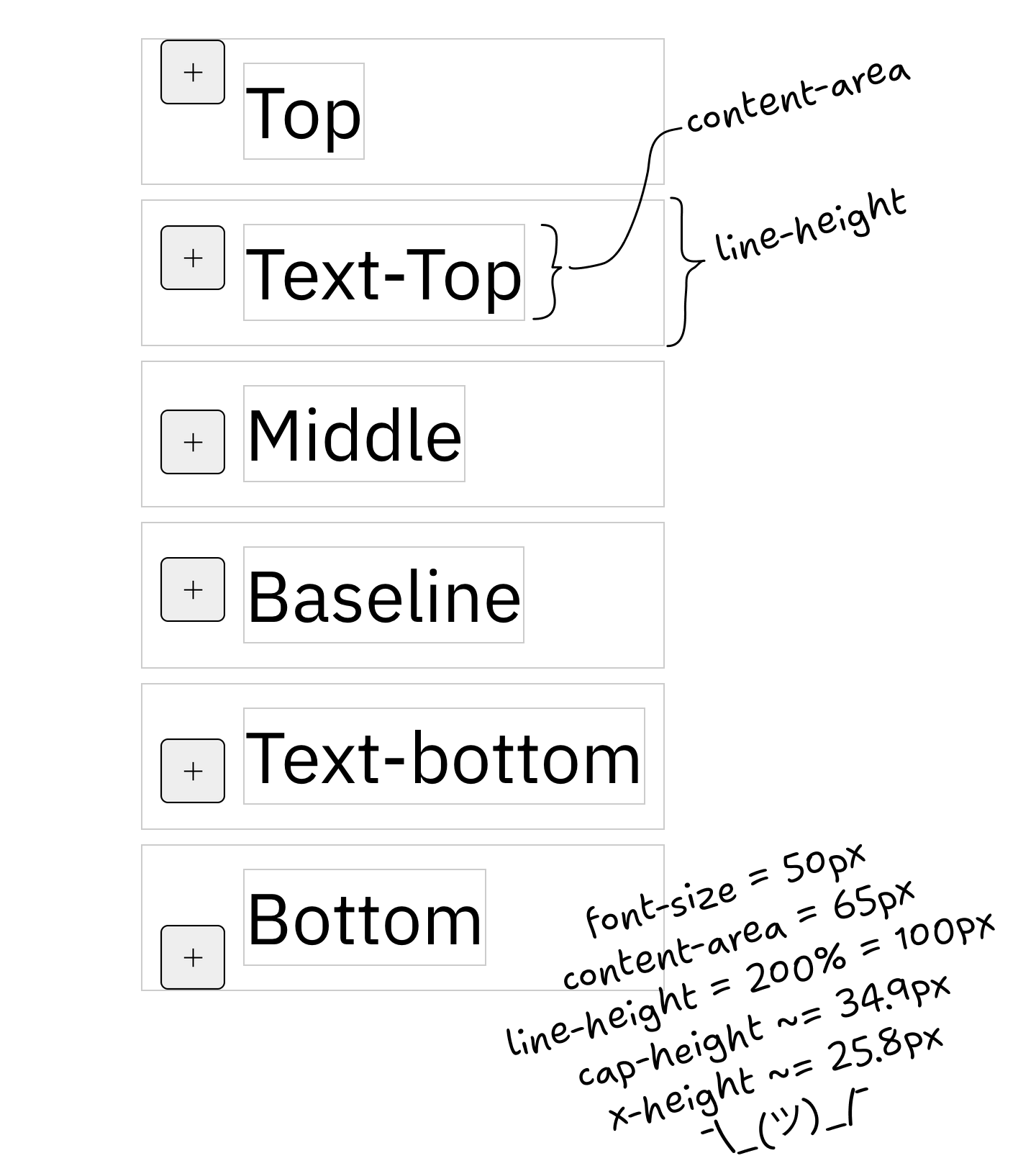
If you are a font designer, make life easier for everybody by setting your metrics so that ascender − cap-height = descender:
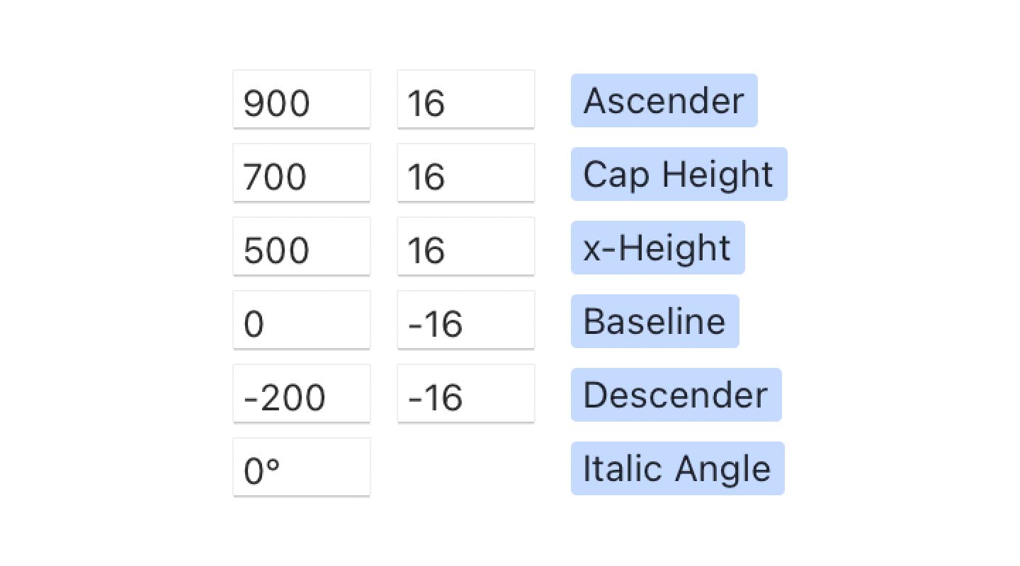
Or the same idea, visually:
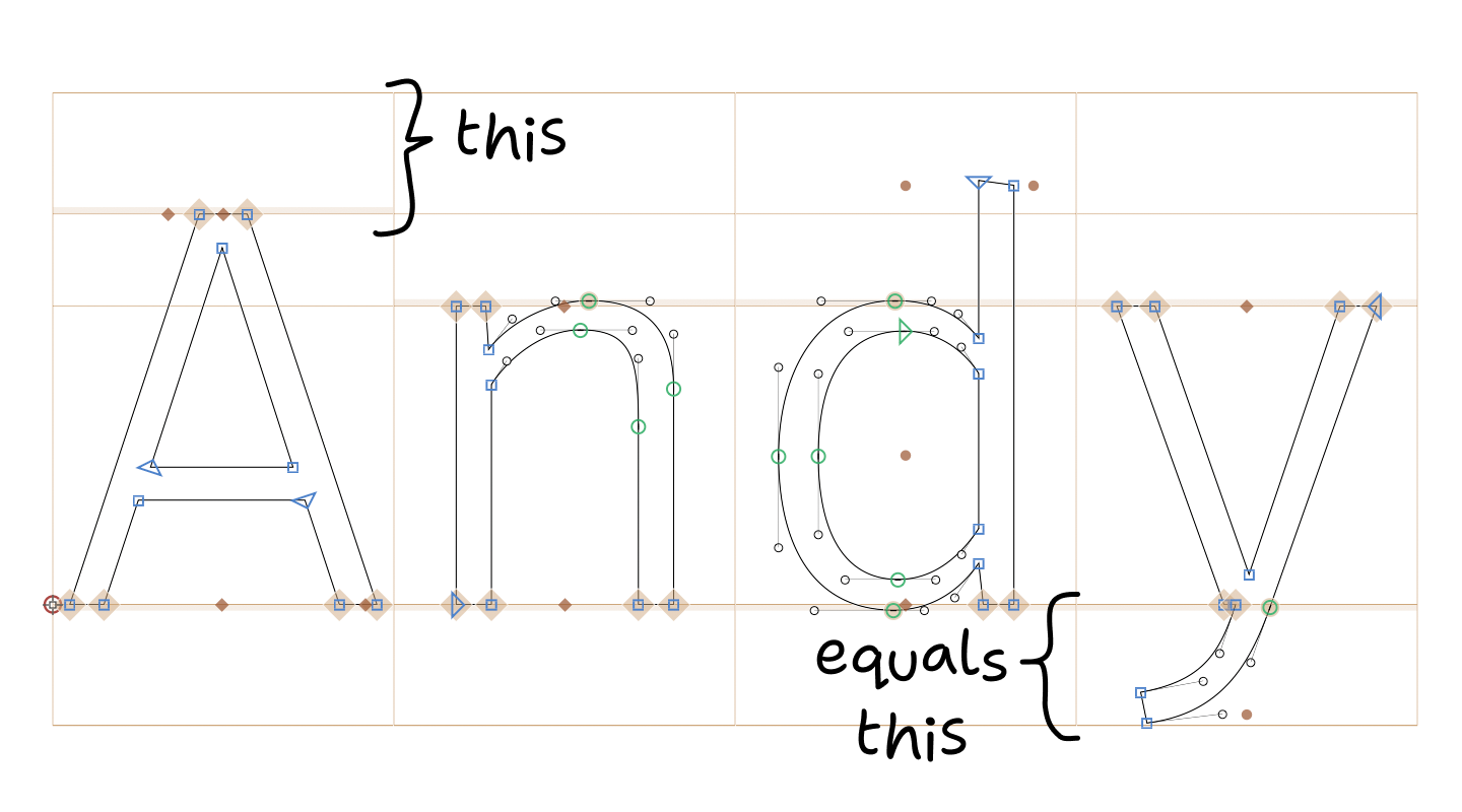
Important! You don’t have to actually extend your ascenders/descenders to these boundaries. As you can see in the picture, my ascender space, for example, is way underutilized. Just make the numbers match.
For both web and native, to avoid headaches, choose a font that already follows this rule. SF Pro Text, Inter, and Martian Mono seem to do this already, so they will center perfectly with no extra effort.
See Font size is useless; let’s fix it for more information.
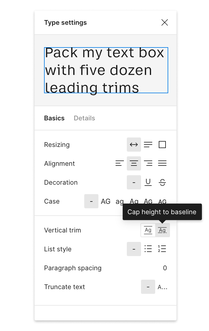
What can be done: web developers
From the developer side, it’s a bit more tricky.
The first thing to understand, you need to know which font you’ll be using. Unfortunately, this doesn’t work if you plan to substitute fonts.
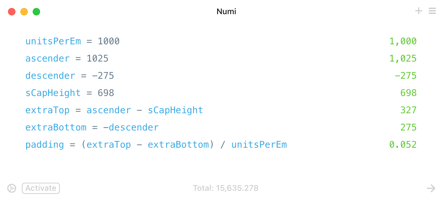
We’ll use IBM Plex Sans, a font used on this very page. IBM Plex Sans has the following metrics:
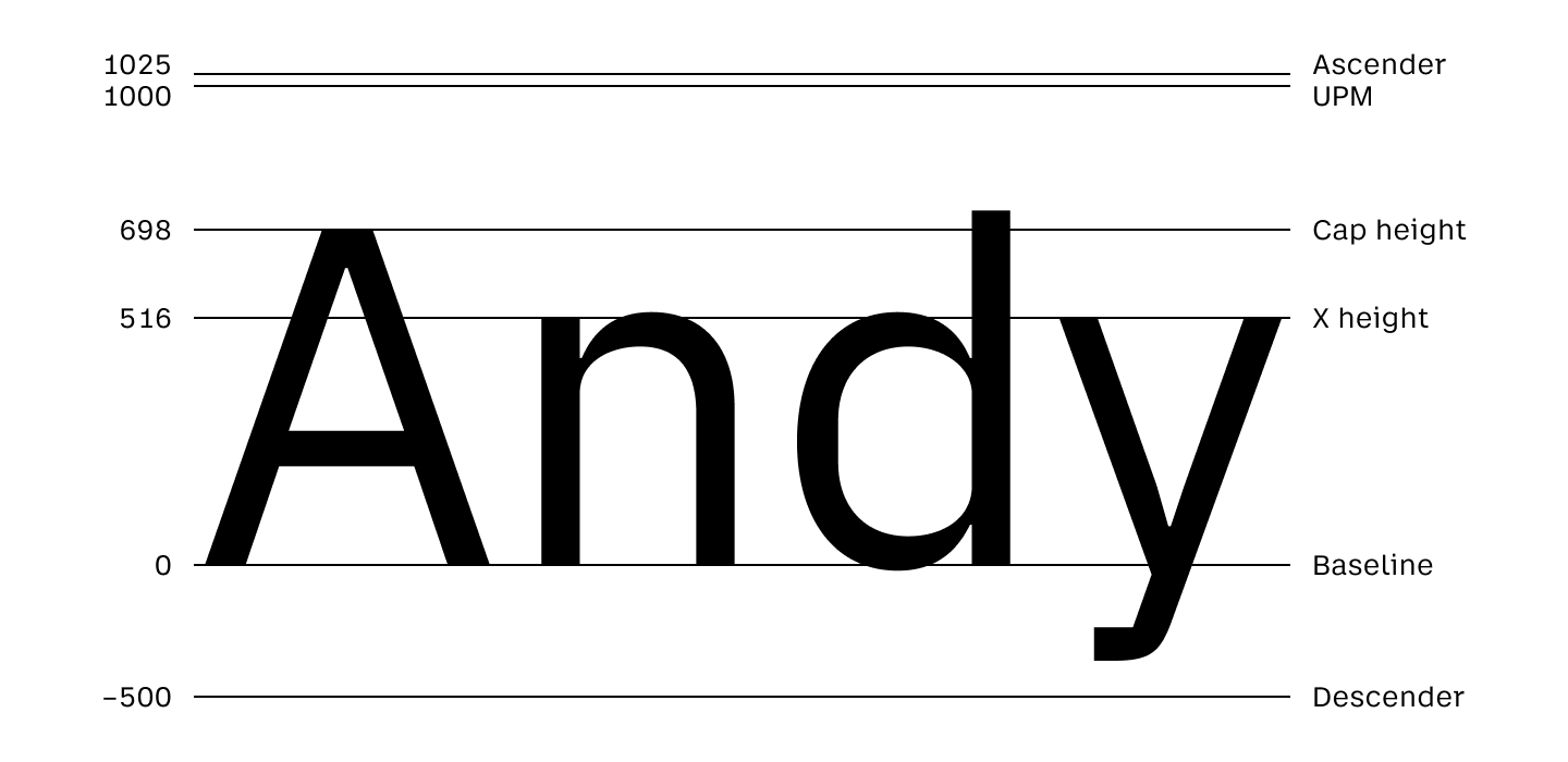
When you set font-size, what you set is UPM (this will also be equal to 1em). However, the actual space occupied by the text block is the space between the ascender and descender.
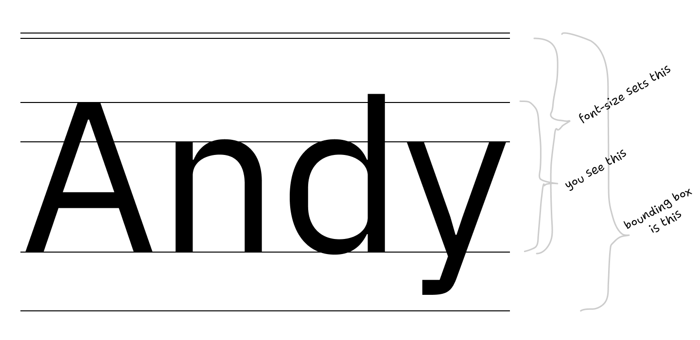
With a few simple calculations, we get that extra padding-bottom: 0.052em should do the trick:
Should work like this:
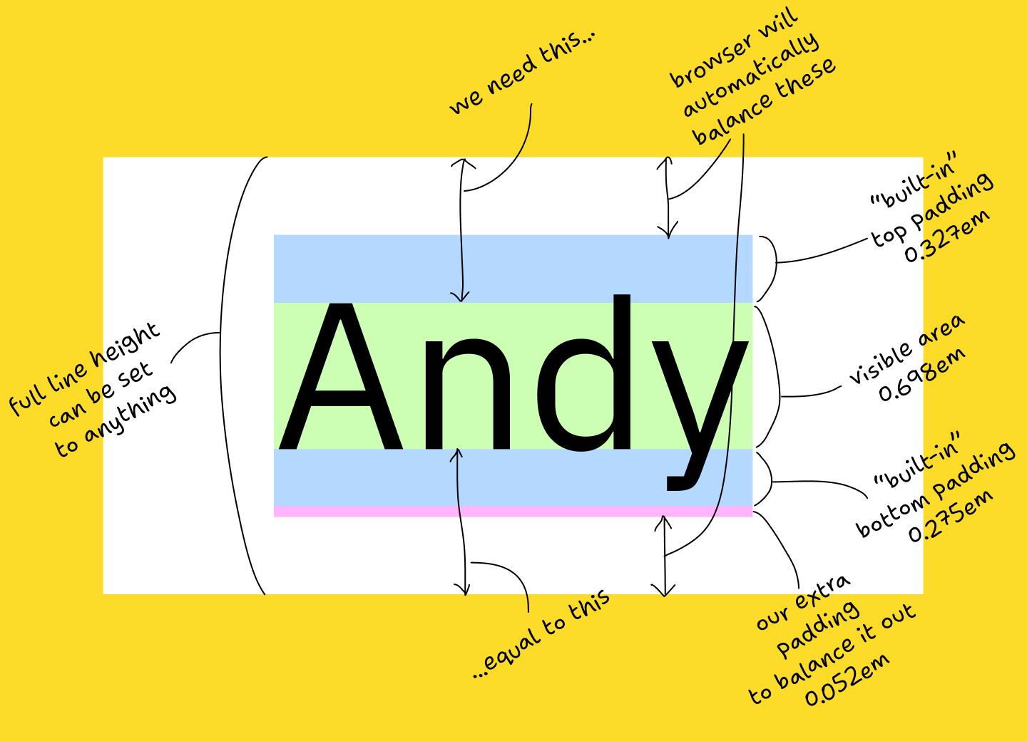
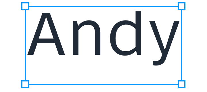
Or in actual CSS (select text to see default text bounding box):
Andy
You can get the required font metrics for your font from opentype.js.org/font-inspector.html (ascender, descender, sCapHeight).
Now that we have that sorted, aligning icons is not that hard too. You set vertical-align: baseline and then move them down by (iconHeight - capHeight) / 2:
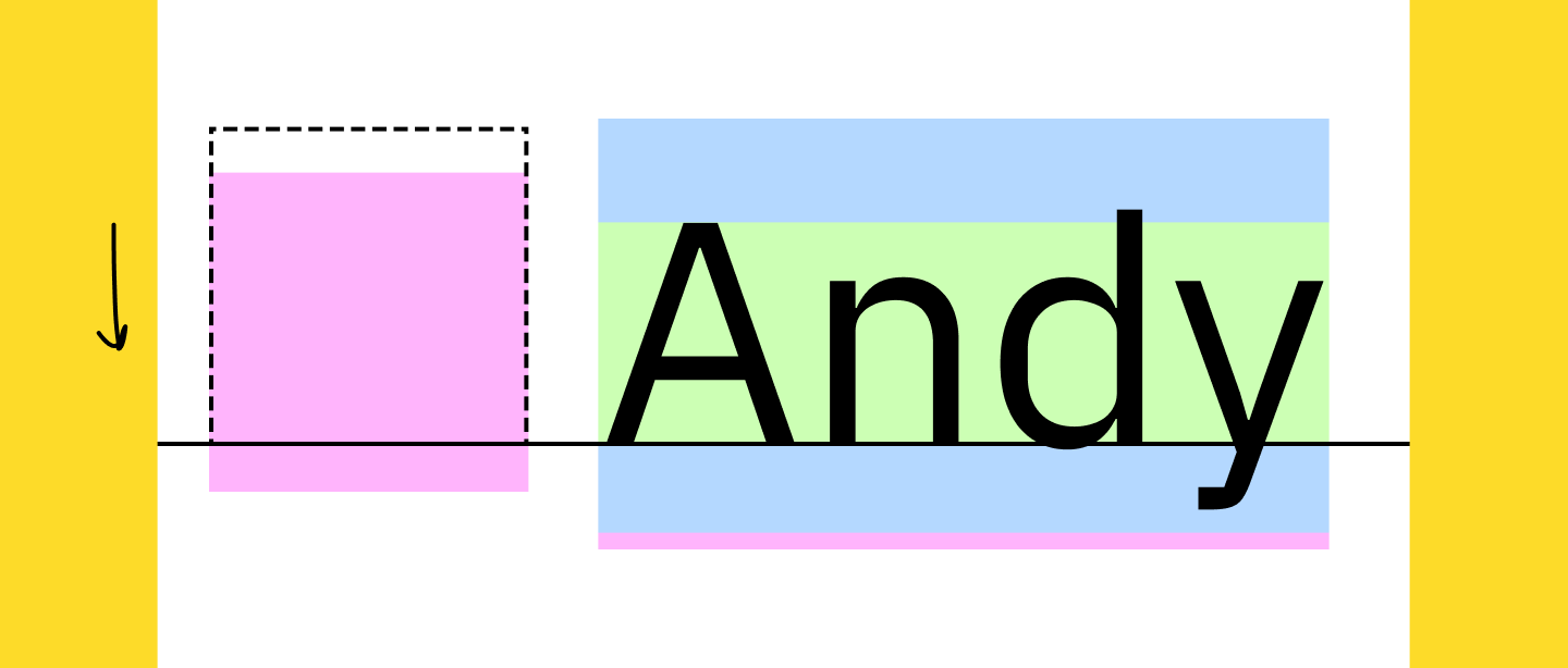
This, unfortunately, requires you to know both font metrics and icon size. But hey, at least it works:
Andy
Again, select the text above to see how different the browser’s bounding box is from the correct position.
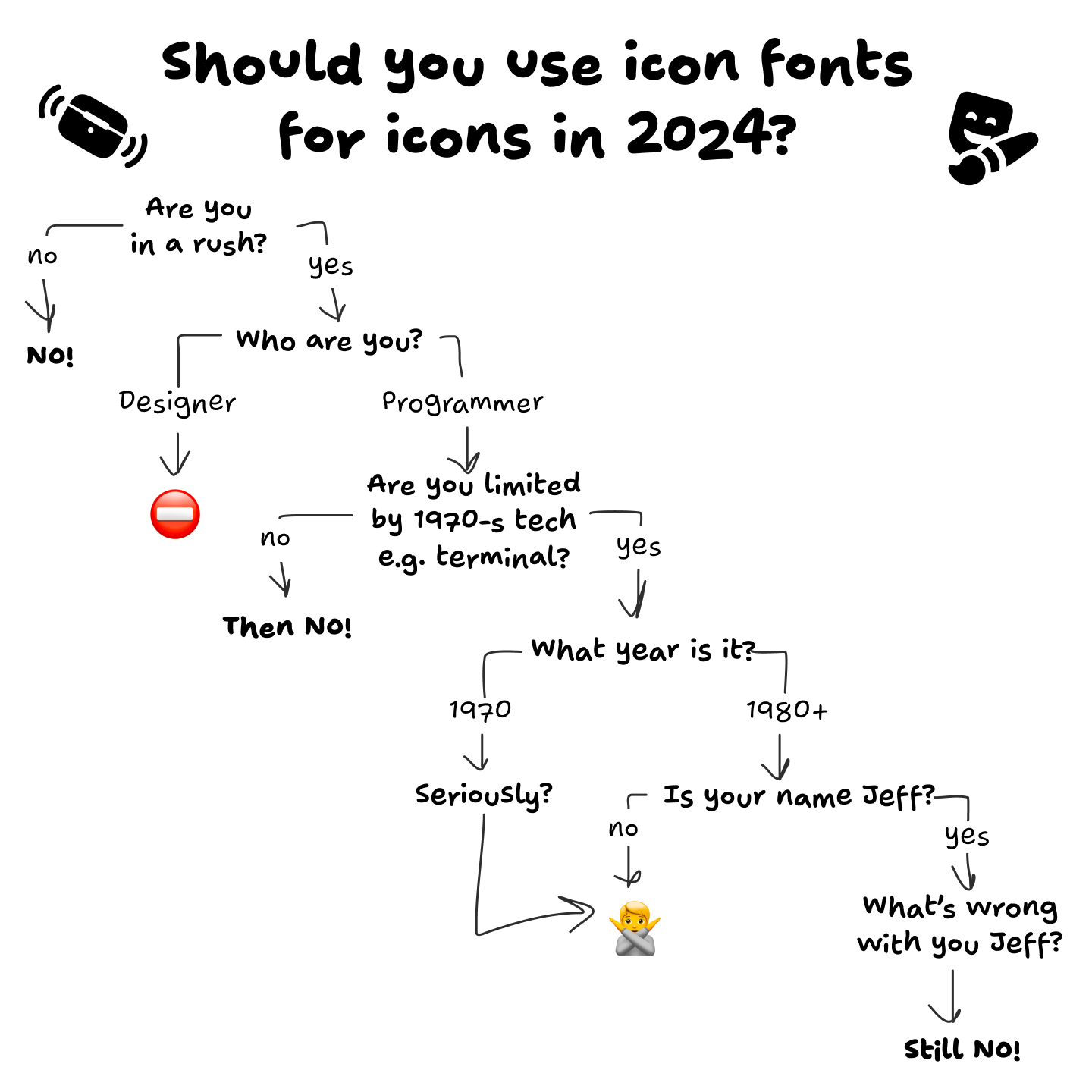
What can be done: icons fonts
STOP.
USING.
FONTS.
FOR.
ICONS.
Use normal image format. The one with dimensions, you know? Width and height?
Here, I drew a diagram for you, to help you make a decision:
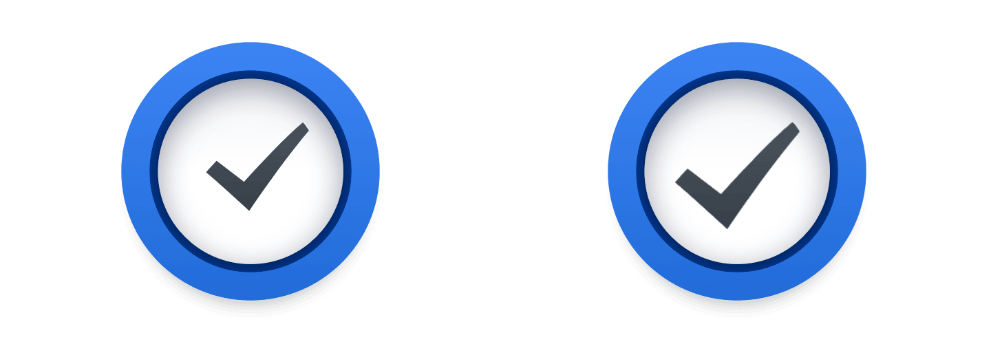
Just look at how hard Apple tries to put the checkmark inside the rectangle, and the rectangle next to the text label:
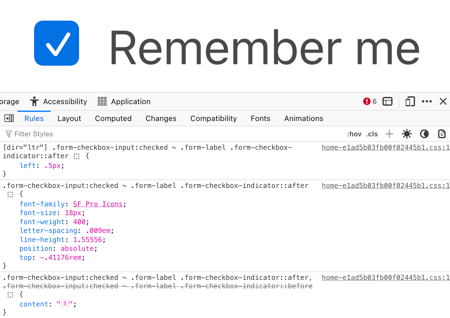
And they still fail!
Nothing is easier than aligning two rectangles. Nothing is harder than trying to align text that has an arbitrary amount of empty space around it.
This is a game that can’t be won.
What can be done: optical compensations
We, developers, can only mathematically align perfect rectangles. So for anything that requires manual compensation, please wrap it in a big enough rectangle and visually balance your icon inside:
What can be done: everyone
Please pay attention. Please care. Bad centering can ruin otherwise decent UI:

But a properly aligned text can make your UI sing:

Even if it’s hard. Even if tools make it inconvenient. Even if you have to search for solutions. Together, I trust, we can find our way back to putting one rectangle inside another rectangle without messing it up.
I, for one, want to live in a world of beautiful well-balanced UIs. I trust that you do, too.
It’s all worth it in the end.
Honorable mention
Our article would be incomplete without this guy:
Take care!
San Antonio, TX
MacRumors (CNN, Hacker News):
Apple on late Thursday into Friday removed the popular messaging and social media apps WhatsApp, Telegram, Signal, and Threads from its App Store in China at the request of the Chinese government, The Wall Street Journal reported.
[…]
In a statement shared with several media outlets, Apple said China’s national internet regulator ordered the removal of the apps from the App Store in the country due to unspecified “national security concerns.” Apple said it is “obligated to follow the laws in the countries where we operate, even when we disagree.”
However, it’s Apple’s choice to make distribution through the App Store a single point of failure.
Previously:
San Antonio, TX
Excerpts from an eye-opening essay by an undergraduate student:
I was surprised to find I spend far, far less time on my classes than on my extracurricular activities... It turns out that I’m not alone in my meager coursework. Although the average college student spent around 25 hours a week studying in 1960, the average was closer to 15 hours in 2015...This fall, one of my friends did not attend a single lecture or class section until more than a month into the semester. Another spent 40 to 80 hours a week on her preprofessional club, leaving barely any time for school. A third launched a startup while enrolled, leaving studying by the wayside... These extreme examples are outliers. But still, for many students, instead of being the core part of college, class is simply another item on their to-do list, no different from their consulting club presentation or their student newspaper article...Half of the blame can be assigned to grade inflation, which has fundamentally changed students’ incentives during the past several decades. Rising grades permit mediocre work to be scored highly, and students have reacted by scaling back academic effort...And therein lies the second reinforcing effect of grade inflation, which not only fails to punish substandard schoolwork but actively incentivizes it, as students often rely on extracurriculars to get ahead. Amanda Claybaugh, dean of undergraduate education, made this point in a recent New York Times interview, saying that “Students feel the need to distinguish themselves outside the classroom because they are essentially indistinguishable inside the classroom.”..One of my classmates last semester, who is one of the more academically oriented people I know, told me that to get the best grade on an important essay, he simply “regurgitated the readings” without thinking critically about the material...This utilitarian approach to schoolwork requires a cultural explanation beyond grade inflation, and some of the blame must be placed on the newly meritocratic nature of college admissions. Although the partial shift away from the monied legacy networks that dominated Ivy League spots has been beneficial overall, the change also initiated a résumé arms race... nationwide surveys of incoming freshman confirm this narrative, as an increasingly large share of first-years view college as preparation for financial success rather than a site of learning per se...This attitude is one manifestation of what Fischman and Gardner call a “transactional model” of college. According to their book, a so-called transactional student “goes to college and does what (and only what) is required to get a degree and then secure placement in graduate school and/or a job; college is viewed principally, perhaps entirely, as a springboard for future-oriented ambitions.”..In contrast, a professor who is also a College alumnus recently told me that he spent most of his time at Harvard taking five or six classes a semester without doing extracurriculars. Hearing that made me think I’ve probably approached this place in the wrong way. I was discussing the professor’s comments with my roommate the other day, and we both agreed that if we were to go back and redo our undergraduate education, we would basically drop all our extraneous clubs and take as many classes as possible.
I'm sure this essay will trigger a lot of responses from readers (most of whom have probably attended college and experienced similar (or opposite) situations, and I anticipate some vigorous comments. I would encourage you to read the essay in its entirety and not rely on my focused excerpts. And note the student is at an elite university, but the principles expressed likely extend broadly across the academic world.
San Antonio, TX
Jon Brodkin, reporting for Ars Technica:
The US Constitution’s Fifth Amendment protection against self-incrimination does not prohibit police officers from forcing a suspect to unlock a phone with a thumbprint scan, a federal appeals court ruled yesterday. The ruling does not apply to all cases in which biometrics are used to unlock an electronic device but is a significant decision in an unsettled area of the law. [...]
Payne’s Fifth Amendment claim “rests entirely on whether the use of his thumb implicitly related certain facts to officers such that he can avail himself of the privilege against self-incrimination,” the ruling said. Judges rejected his claim, holding “that the compelled use of Payne’s thumb to unlock his phone (which he had already identified for the officers) required no cognitive exertion, placing it firmly in the same category as a blood draw or fingerprint taken at booking.”
“When Officer Coddington used Payne’s thumb to unlock his phone — which he could have accomplished even if Payne had been unconscious — he did not intrude on the contents of Payne’s mind,” the court also said.
Via Jamie Zawinski, whose advises never using Touch ID or Face ID. I strongly disagree with that advice. Almost everyone is far more secure using Face ID rather than relying on a passcode/passphrase alone. People who don’t use Face/Touch ID are surely tempted to use a short easily-entered passcode for convenience, and anyone who disables Face/Touch ID while using a nontrivial passphrase is encountering a huge inconvenience every single time they unlock their phone. There’s no good reason to put yourself through that.
My advice is to internalize the shortcut to hard-lock an iPhone, which temporarily disables Face/Touch ID and requires the passcode to unlock: squeeze the side button and either of the volume buttons for a second or so. I wrote an entire article about this two years ago. Don’t just learn this shortcut, internalize it, so that you don’t have to think about it under duress. Just squeeze the side buttons until you feel the phone vibrate. Then it’s hard-locked. Do this whenever you go through security — be it at the airport, the ballpark, or anywhere. If you see a magnetometer, hard-lock your iPhone. If you get pulled over by a cop while driving, hard-lock your phone before you do anything else. (You can still launch the Camera app from the lock screen to record the encounter, if you wish, while the phone remains hard-locked.) Tell everyone you know how to hard-lock their iPhones.
(Also, this ruling is specific to the details of this particular case, and thus only addresses fingerprint authentication, not facial recognition. Those concerned with civil liberties should presume, though, that the same court would rule similarly regarding cops unlocking a device by waving it in front of the suspect’s face. But with “Require Attention for Face ID” — which is on by default — Face ID won’t work if you keep your eyes closed, and I don’t think a court would allow police to force your eyes open. The trick to worry about is the police handing you back your phone, under the pretense that you can use it to make a call or something, and then yanking it from your hands after you unlock it.)
San Antonio, TX
[AI can be really, really dumb.]
A tip from friend-of-the-site Alex S. led me to enjoy a good laugh at X Formerly Twitter’s expense. It seems their AI bot Grok recently decided to just fabricate an entire news story out of thin air. It’s some really incredible nonsense.
As Golden State was eliminated from the NBA playoffs on Tuesday, Warriors guard Klay Thompson had a rough night. Despite playing 32 minutes, he put up 0 points while shooting 0-for-10. In basketball slang, he shot bricks.

Though that’s a very ugly stat line, it’s not actually criminal. Grok, however, believed otherwise:

This is like a game of Telephone, being presented as real news. It’s funny, but it’s also pretty terrible.
As you might be able to make out, that fictitious story includes this very hard-to-read disclaimer:
Grok is an early feature and can make mistakes.
Clearly.
San Antonio, TX
Next Page of Stories