 Log in


macOS’s System Settings app might be a contender for the worst piece of software Apple released this century. Its 2022 redesign was based on wrong assumptions, the execution of that already bad redesign idea has also been subpar, and the situation not only hasn’t gotten any better in recent memory – I can point you to years-old bugs – but now it is spreading like gangrene to other apps.
Among System Settings’ numerous UI crimes stands a simple, but incredibly important one: the app does a bad job at conveying to the users where they are, in a place orientation feels very important. A lot of this is self-inflicted, with bad search and confusing pop-ups partying with truly embarrassing bugs…
Actually, one literally just happened to me. The only thing I did was opening System Settings:
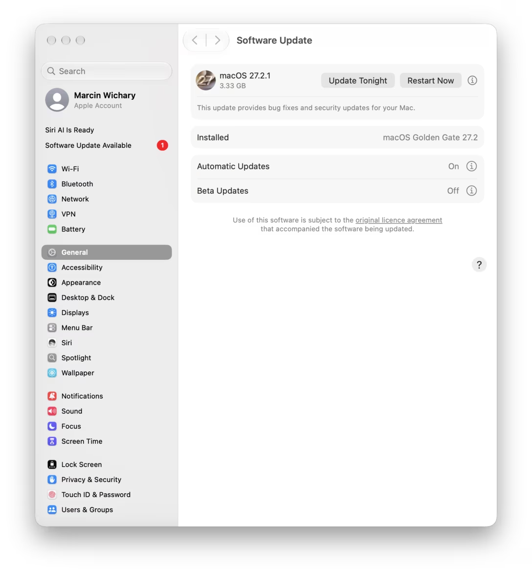
Which section am I in? General, right? That’s the one highlighted? No, turns out that “Software Update Available” added itself post launch and stole the content pane, but didn’t update the nav on the left:
This is embarrassing because it highlights that Settings are built in a shoddy way that allows the content and the left nav to get disconnected. The end result is yet another design problem that makes it hard for me to build in my mind the accurate map of all the settings, and to understand where each one goes and how they all connect. And I have a feeling I’m not the only one.
But this is not actually what I wanted to show you. (I just got distracted by a bug on the way to where I was going.) The problem I wanted to share is more universal and helpful to know about.
Let’s say I search for “hide dock”:
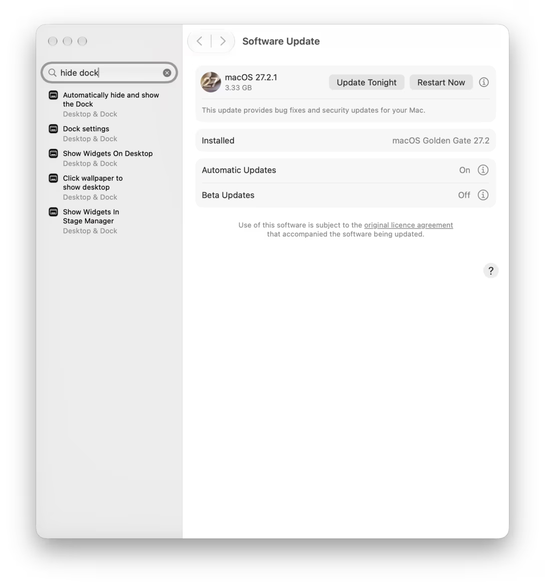
The first result is what I wanted, and clicking on it gets me there:
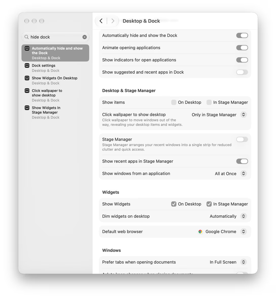
Type and click! It all seems great on the surface. The topmost option on the right is what I want; I can toggle it and move on with my life.
But I might not realize that the right pane has been scrolled down to that option, and there’s a bunch of stuff above it, too.
This is tricky, because sometimes it’s useful to know what the whole section’s name is. Or, maybe, the option I wanted is influenced by the option just above it, which I might now not even realize exists.
Mostly, auto scroll is disorienting. The shy scrollbars are on by default, so they won’t lend a helping thumb. The light separator line that appears below the header is hard to notice. So is the blurred appearance of the closest scrolled-off thing underneath it. I am certain most people arriving at any scrolling container already pre-scrolled will assume the container is just… shorter.
This is a problem you see on the web, too. There are solutions out there: you can animate-scroll to the right place on entry, or you can leave some space above (a clever trick is to calculate the distance so that one of the options left above is cut in half, conveying more stuff in that direction) – although both of these work better for section headers rather than specific elements like here.
What would probably be best for setting would be to… point to the found thing. And what’s interesting is that Apple already built a fun mechanism for it:
It’s a little goofy, seemingly inspired by those tabs for signing documents…
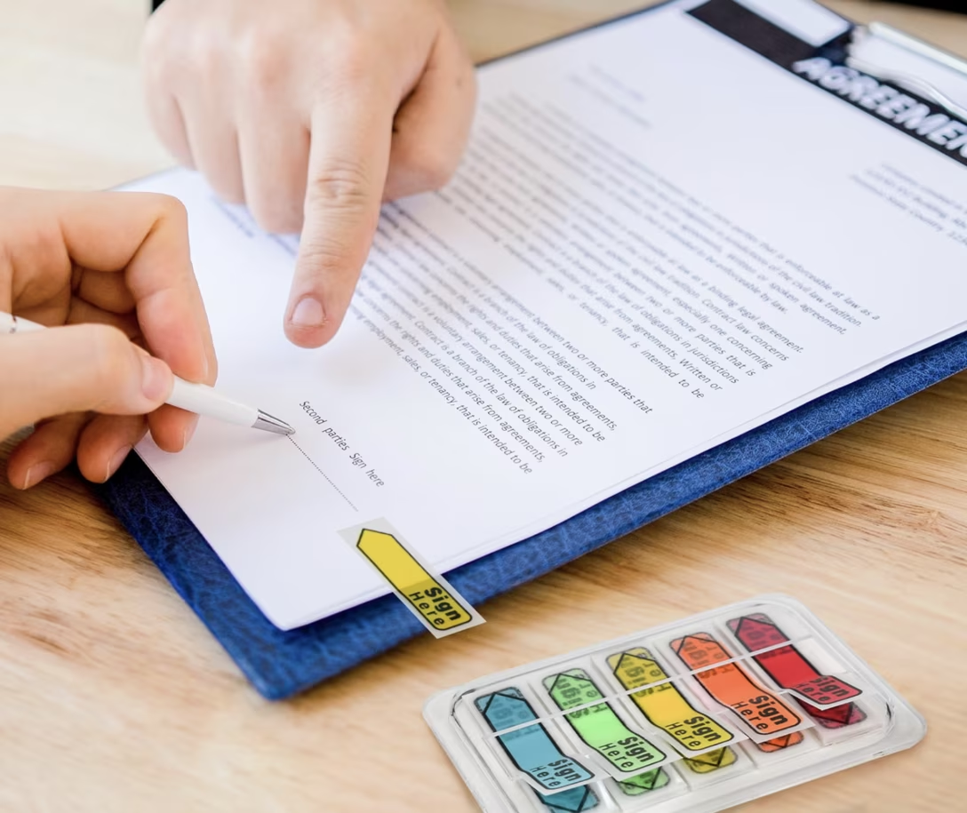
…but most of its complexity has more to do with two menus next to each other. The pointing does its job well.
And, even if it could use a refresh or some improvements, in a perfectly functioning ecosystem the System Settings team would grab that interface, reuse it, polish it, and give the newer revision back to the Help menu as well. In the process, the user would benefit thrice: first by seeing help improve, second by getting a better orientation mechanism for the settings, and third by experiencing and learning a consistent pattern across many surfaces.
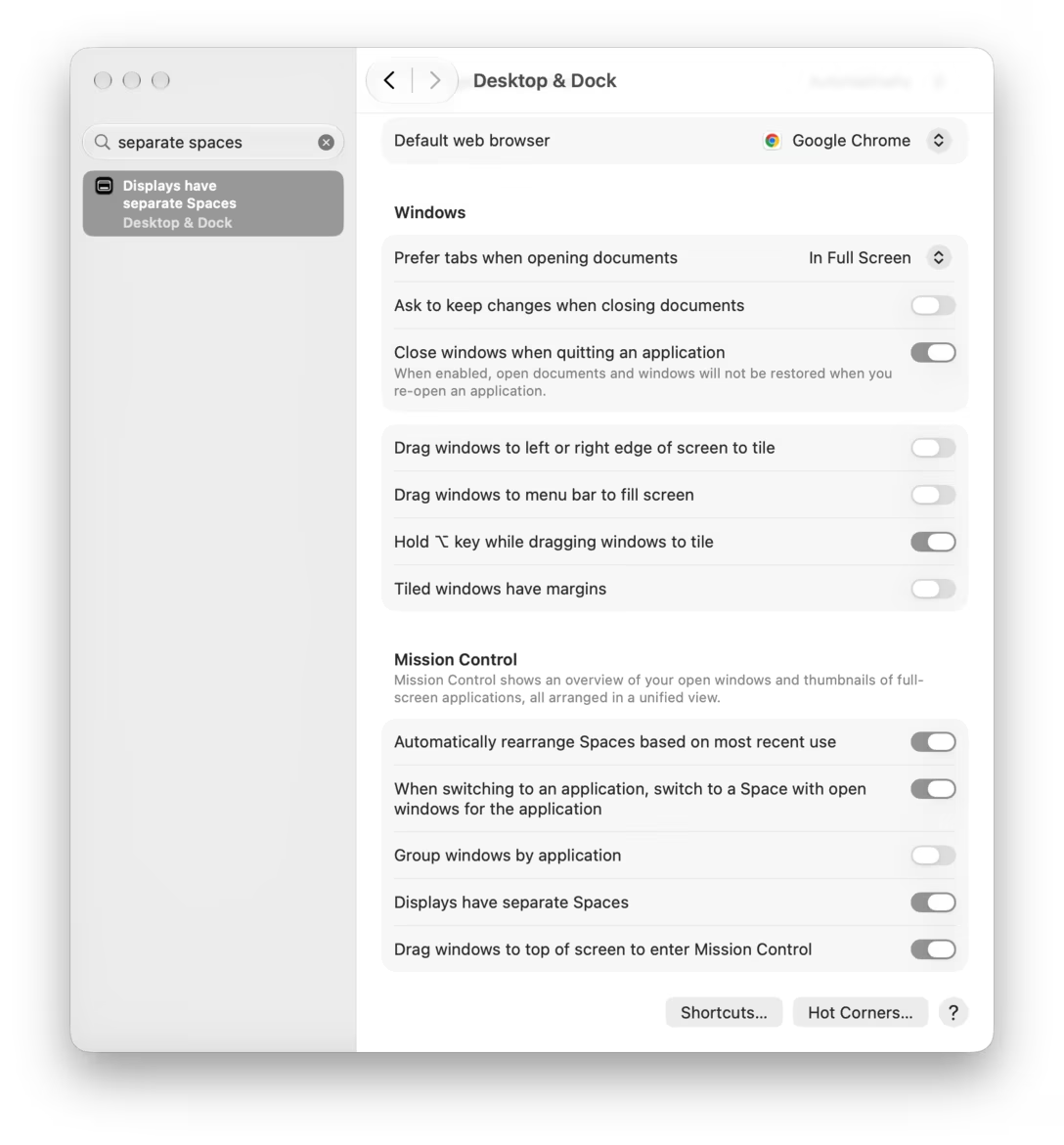
(Lastly, many among you might have already realized this: scrolling as a method was doomed from the beginning. If the found item is closer to the bottom of the container, like below, there is just no way to pull it all the way to the top anyway.)
(I added a new tag, navigation, to collect posts like these. The title of the post is a reference to a logistics term.)
#mac os #navigation #settings #system design


