Christ is my all
2723 stories
·
3 followers

Jensen Huang Resigns From Nvidia

1 Comment

Nvidia Newsroom:

Nvidia Board of Directors announced today that Jensen Huang has resigned as President, Chief Executive Officer, and a member of the Board, effective immediately.

Colette Kress, current Executive Vice President and Chief Financial Officer of NVIDIA, has agreed to serve as Interim Chief Executive Officer. Kress will continue to serve as Executive Vice President and Chief Financial Officer while serving as Interim Chief Executive Officer until a permanent successor has been named. The Board is initiating a search for a permanent Chief Executive Officer and will consider internal and external candidates. [...]

“Colette has helped lead NVIDIA through a period of extraordinary growth and has a deep understanding of our business, customers, operations and financial position,” said Harvey Jones, Chair of the NVIDIA Board of Directors. “She is supported by an experienced leadership team that has been instrumental in executing NVIDIA’s strategy and advancing its technology roadmap. The Board has full confidence in Colette and the leadership team, and we expect the company’s operations, customer commitments and product roadmap to continue without interruption.”

This might be wishful thinking. Remember all the predictions that Apple would implode without Steve Jobs? That he was the company? I argued, on the day of his resignation, that Apple was likely to continue to thrive post-Jobs, writing, “Jobs’s greatest creation isn’t any Apple product. It is Apple itself.” He built a great company with a deep bench and a highly distinctive, incredibly strong culture.

I’m not seeing anyone say those things about Nvidia. In fact I’ve only seen the opposite — that Nvidia has a weak board and an executive structure with Huang at the top and 60 direct reports under him. Nvidia sounds like it is the fantasy version of Apple that people imagined when Jobs’s health finally failed.

The press release contains no quote from Huang, and his X account is silent.

Nvidia will report its third-quarter fiscal 2027 financial results on Tuesday, November 17, at approximately 1:20 p.m. PT, as previously scheduled, followed by its earnings call at 2 p.m. PT.

They should sell tickets to this one.

Link: nvidianews.nvidia.com/news/nvidia-announces-ceo-transition

Read the whole story
rtreborb
14 hours ago
reply
60 direct reports is insane.
San Antonio, TX
Share this story
Delete

Spoiled for Choice: Two New Graphic Novels of Pilgrim’s Progress

1 Share
Pilgrims Progress Graphic Novels

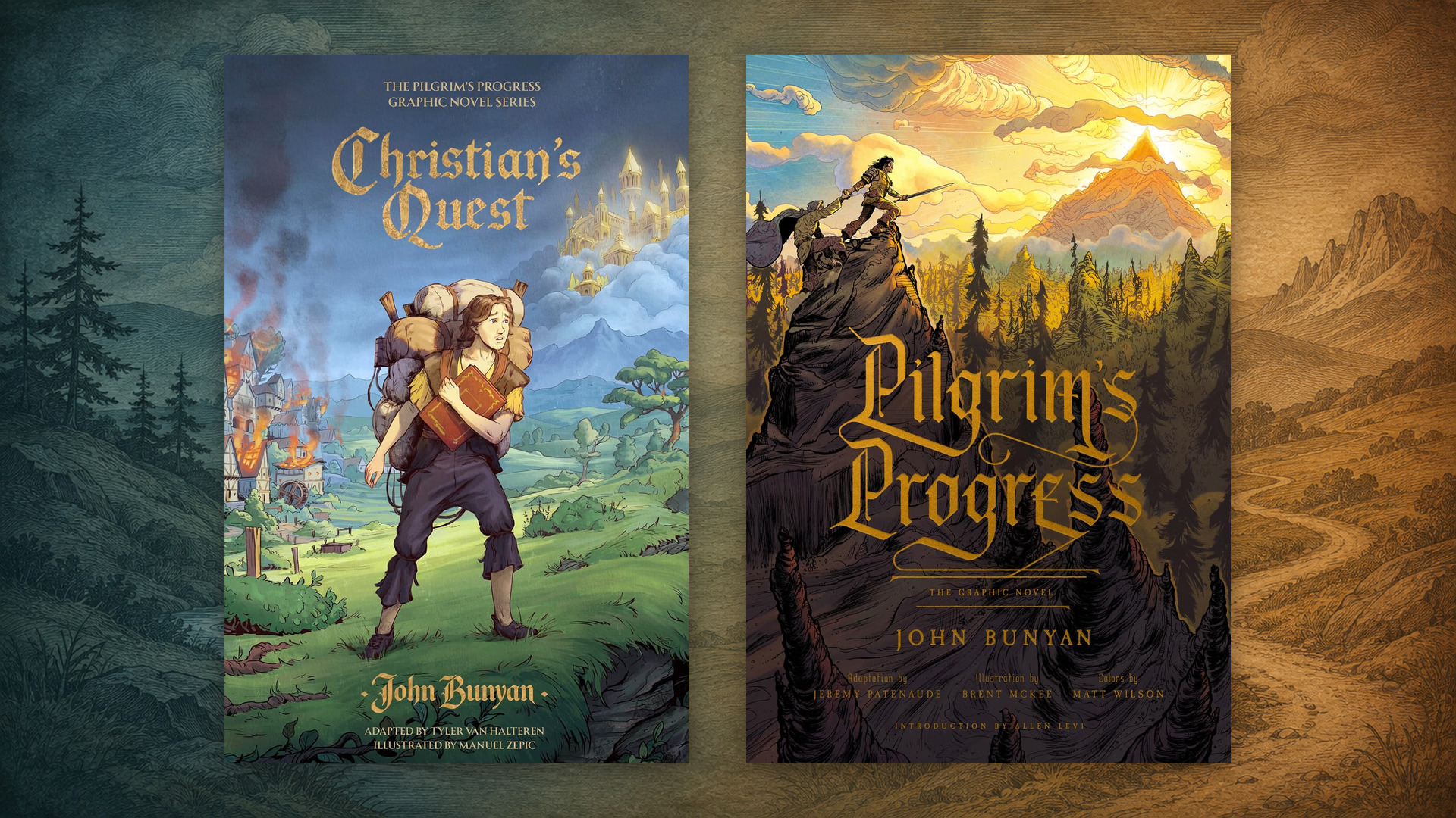
I have often expressed how spoiled Christian readers are today. As if we needed more proof of this, how about the fact that in a single month, publishers released not one but two major graphic novel adaptations of Pilgrim’s Progress? Both are well-written, beautifully illustrated, and faithful to Bunyan’s story. Let me help you understand their similarities and differences and tell you which one might be best to add to your library.

Christians Quest

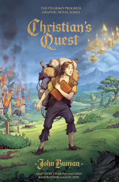
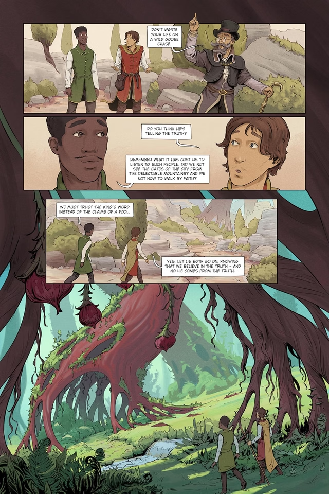
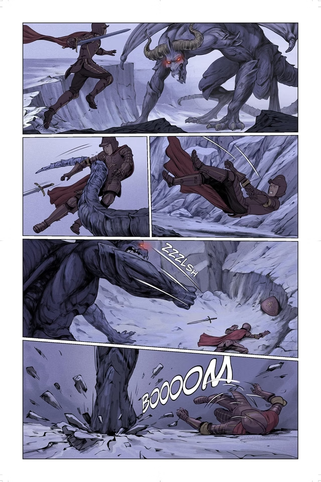
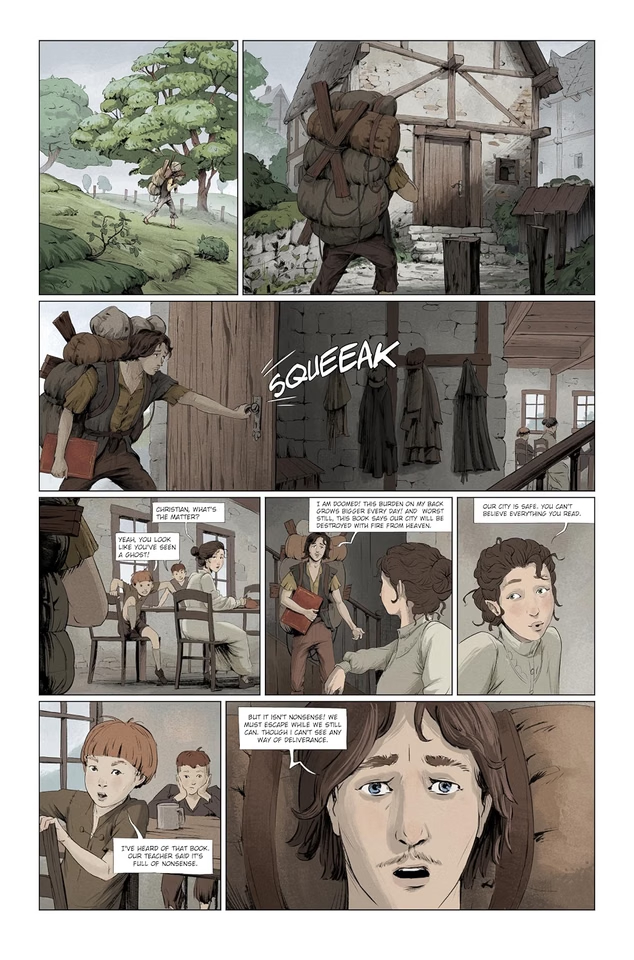
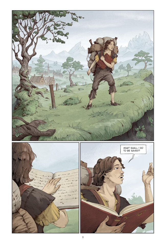
Christian’s Quest is written by Tyler Van Halteren and illustrated by Manuel Zepic. It is published by Lithos Kids, which has already released the three-part Little Pilgrim’s Big Journey, an illustrated adaptation of Pilgrim’s Progress for young readers, and The Mansoul Chronicles, which is based on Bunyan’s Holy War. It is a 220-page 7×10.63 inch hardcover that targets children aged 8+, though it is meant to be enjoyed by teens and adults as well. Its illustrations are what I might describe as a clean, polished YA style. The lines are thin and tidy and much of the form comes from shading. The colors tend to maintain a soft, muted, painted look. It lightly updates some antiquated language so that Bunyan’s Slough of Despond becomes the Bog of Despond. Christian is youthful and fresh-faced, and his burden is a bulging pack on a frame. It includes some bonus material: a behind-the-scenes look at how a graphic novel is made, and a study guide that explains and applies each of the stages of Christian’s quest. It also indicates that a sequel, Christiana’s Crown, will be released in 2028.

Pilgrims Progress Graphic Novel

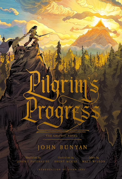
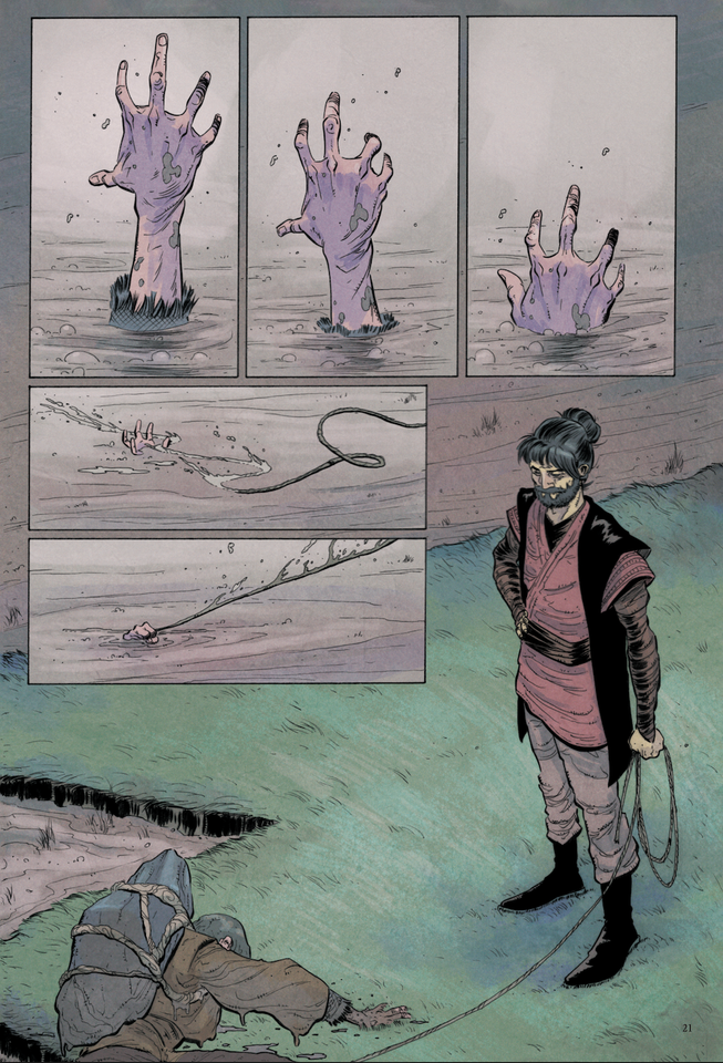
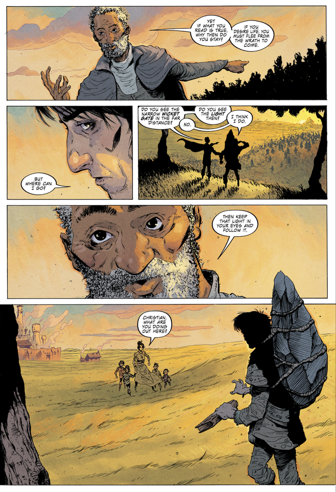
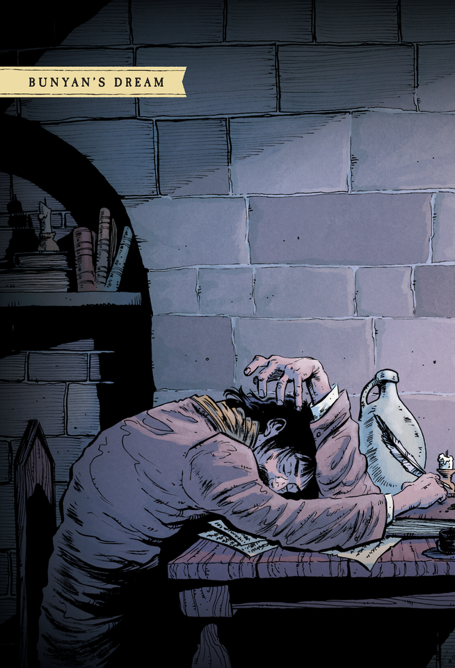
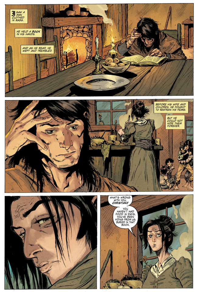
Pilgrim’s Progress: The Graphic Novel is written by Jeremy Patenaude, illustrated by Brent McKee, colored by Matt Wilson, and lettered by Taylor Esposito. It is published by Crossway as what I believe is the company’s first graphic novel, though it has a long history of publishing books for young readers. It is a 256-page 7×10.25 inch paperback that targets readers aged 14+. Its illustrations are what I might describe as gritty and stylized and perhaps a bit more indie than mainstream. It uses heavy brush ink, dark shadows, and vivid colors. It does not update Bunyan’s antiquated language. Christian is a gaunt, tormented, weathered adult whose burden is a huge stone roped to his back. Its bonus material includes a lexicon of the key characters and locations and reflections on each of the chapters. There is no indication of a sequel that will cover Christiana’s quest.

While these two graphic novels tell the same story and tell it faithfully using dialogue and illustration rather than narration, they tell it using different visual language largely because Christian’s Quest is meant to be accessible to a younger demographic. You might say that Christian’s Quest is a bit more kid-friendly and Pilgrim’s Progress is a bit more adult-friendly, though both could easily be enjoyed by kids and adults alike. After all, who doesn’t enjoy reading the occasional graphic novel? Another key difference is that Pilgrim’s Progress is a paperback where Christian’s Quest is being sold as more of an heirloom object that features cloth binding, gold foil, and a ribbon marker.

Let me show you a few examples of the art from each book.

Christian’s Quest

Pilgrim’s Progress

My Recommendation

Which do I recommend? Either! Both! If your readers are younger, Christian’s Quest is the more obvious choice, and if they are older—teenagers and up—they may prefer Pilgrim’s Progress. But you couldn’t go wrong with either, and you couldn’t go wrong with picking up both.

Where to Buy

Christian’s Quest cover

Christian’s Quest

Lithos Kids · clothbound hardcover · ages 8+

Pilgrim’s Progress: The Graphic Novel cover

Pilgrim’s Progress: The Graphic Novel

Crossway · paperback · ages 14+

Read the whole story
rtreborb
14 hours ago
reply
San Antonio, TX
Share this story
Delete

Report: The DC mass shooter was a doctor who went berserk because his HOA wouldn't fix his mold problem

1 Share

An E.R. doctor???

Read the whole story
rtreborb
17 hours ago
reply
San Antonio, TX
Share this story
Delete

Cats Sing the '80s

1 Share


Generation X will always remember the music of the 1980s as their time. While its not the music of my adolescence, I spent the decade playing pop music on radio, so I also have a soft spot for the music of the decade. Enjoy a collection of cats (and other animals) illustrating puns and jokes based on the most memorable songs of the '80s. Continue reading for more.


The images were gleaned from Fark Caturday threads over the years. See more cat galleries here. 
Read the whole story
rtreborb
23 hours ago
reply
San Antonio, TX
Share this story
Delete

System Settings and its last mile problem

1 Share

macOS’s System Settings app might be a contender for the worst piece of software Apple released this century. Its 2022 redesign was based on wrong assumptions, the execution of that already bad redesign idea has also been subpar, and the situation not only hasn’t gotten any better in recent memory – I can point you to years-old bugs – but now it is spreading like gangrene to other apps.

Among System Settings’ numerous UI crimes stands a simple, but incredibly important one: the app does a bad job at conveying to the users where they are, in a place orientation feels very important. A lot of this is self-inflicted, with bad search and confusing pop-ups partying with truly embarrassing bugs…

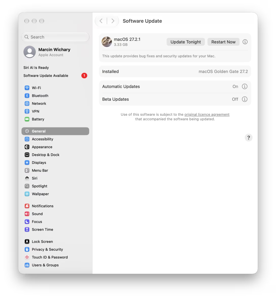
Actually, one literally just happened to me. The only thing I did was opening System Settings:

Which section am I in? General, right? That’s the one highlighted? No, turns out that “Software Update Available” added itself post launch and stole the content pane, but didn’t update the nav on the left:

This is embarrassing because it highlights that Settings are built in a shoddy way that allows the content and the left nav to get disconnected. The end result is yet another design problem that makes it hard for me to build in my mind the accurate map of all the settings, and to understand where each one goes and how they all connect. And I have a feeling I’m not the only one.

But this is not actually what I wanted to show you. (I just got distracted by a bug on the way to where I was going.) The problem I wanted to share is more universal and helpful to know about.

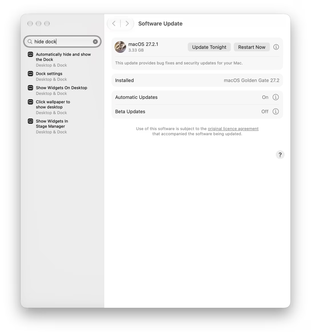
Let’s say I search for “hide dock”:

The first result is what I wanted, and clicking on it gets me there:

Type and click! It all seems great on the surface. The topmost option on the right is what I want; I can toggle it and move on with my life.

But I might not realize that the right pane has been scrolled down to that option, and there’s a bunch of stuff above it, too.

This is tricky, because sometimes it’s useful to know what the whole section’s name is. Or, maybe, the option I wanted is influenced by the option just above it, which I might now not even realize exists.

Mostly, auto scroll is disorienting. The shy scrollbars are on by default, so they won’t lend a helping thumb. The light separator line that appears below the header is hard to notice. So is the blurred appearance of the closest scrolled-off thing underneath it. I am certain most people arriving at any scrolling container already pre-scrolled will assume the container is just… shorter.

This is a problem you see on the web, too. There are solutions out there: you can animate-scroll to the right place on entry, or you can leave some space above (a clever trick is to calculate the distance so that one of the options left above is cut in half, conveying more stuff in that direction) – although both of these work better for section headers rather than specific elements like here.

What would probably be best for setting would be to… point to the found thing. And what’s interesting is that Apple already built a fun mechanism for it:

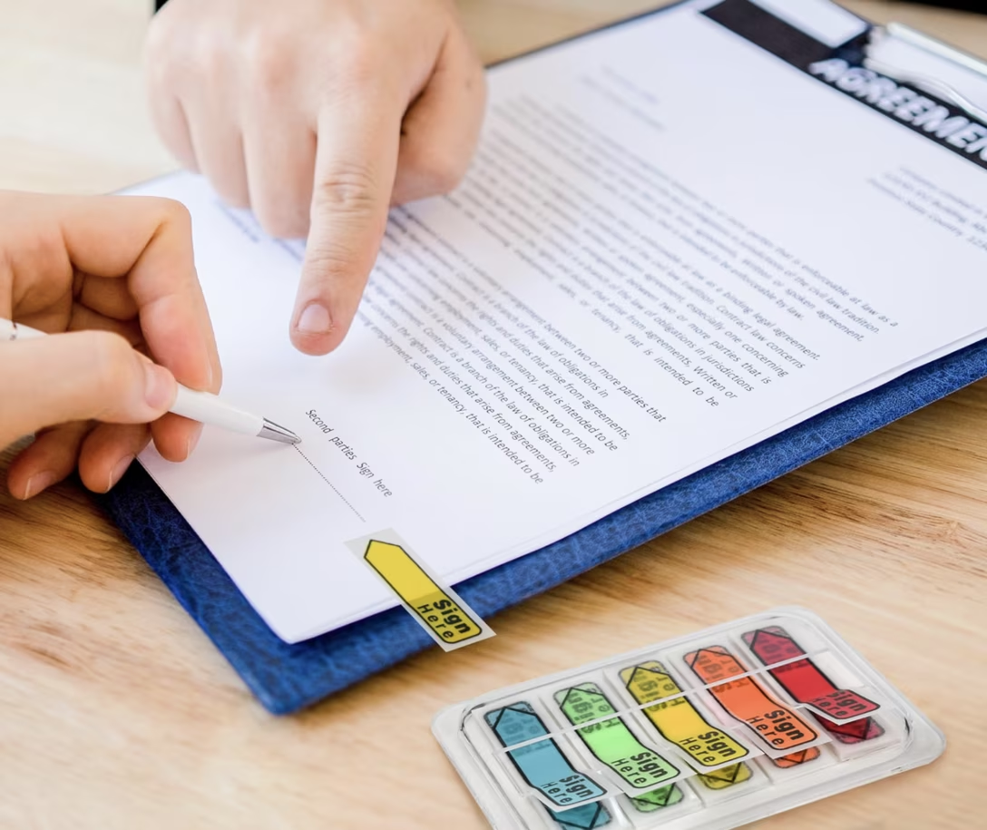
It’s a little goofy, seemingly inspired by those tabs for signing documents…

…but most of its complexity has more to do with two menus next to each other. The pointing does its job well.

And, even if it could use a refresh or some improvements, in a perfectly functioning ecosystem the System Settings team would grab that interface, reuse it, polish it, and give the newer revision back to the Help menu as well. In the process, the user would benefit thrice: first by seeing help improve, second by getting a better orientation mechanism for the settings, and third by experiencing and learning a consistent pattern across many surfaces.

(Lastly, many among you might have already realized this: scrolling as a method was doomed from the beginning. If the found item is closer to the bottom of the container, like below, there is just no way to pull it all the way to the top anyway.)

(I added a new tag, navigation, to collect posts like these. The title of the post is a reference to a logistics term.)

#mac os #navigation #settings #system design
Read the whole story
rtreborb
1 day ago
reply
San Antonio, TX
Share this story
Delete

The Onion Bowl

1 Share

[“The Tsunami Bowl” sounds pretty good to me.]

In order to increase subscriber numbers, The Onion is trying to sponsor a college football bowl game. Why the heck not?

Apparently, a sponsorship can be had for a few hundred thousand dollars. Can we all go splitsies and get our own ridiculous bowl?

Link: https://www.inc.com/sam-blum/the-onion-college-football-bowl-game-sponsor/91432377?

Read the whole story
rtreborb
1 day ago
reply
San Antonio, TX
Share this story
Delete
Next Page of Stories